This exercise is designed to show how to use the most basic change one can make using a camera: changing from a horizontal (landscape) format to vertical (portrait).
I use vertical a lot in practice as it adds depth to an image; for buildings it is often the preferred format for the very reason that it is the only way to get the whole structure in the frame without a lot of extraneous detail; portrait works well for people too and even for landscapes when a strong foreground is required.
Probably more than for horizontal, vertical images require a strong subject; merely taking an image in what is the non-normal format immediately asks of the audience: why vertical?
I chose Bath Abbey and its surroundings for this exercise. I wanted somewhere where there were buildings, people, interiors and landscapes all in one area so I could take images quickly, firstly in vertical then in horizontal. The course notes imply that one should take 20 verticals then similar scenes in horizontal but I could see no reason not to take the same photograph in both formats simultaneously; to do otherwise would make comparison of people pictures in particular very difficult.
The area was ideal, helped by taking the hourly Tower tour to the top of the Abbey. I set out below the 20 pairs of images with commentary on here the vertical format clearly works and where it is less successful. In the nature of the exercise, I was seeking subjects that lent themselves to vertical so the exercise is perhaps not entirely representative of the average situation.
I set out the commentary by comparing the vertical and horizontal formats for each pair -the notes do not suggest this but it seemed to me the best way to demonstrate the points.
I have not included details of shutter speeds and aperture sizes in this exercise, it seemed unnecessary.
I should add lastly that I aimed to take each pair of images with the same focal length, otherwise the comparison becomes complicated by the confounding factor of not taking quite the same image; this was not done for every image pair, but most.
I mainly used a standard 18-50 lens for this exercise - its light weight aids quick turn around.
This is a much taken photograph of Bath Abbey; the classic view. If any evidence that a building is best taken vertically, this is it. The vertical format does justice to the size of the building relative to the people at the base, the horizontal image does the opposite.
Vertical format suits the street performers from this angle, the horizontal leading the eye to the left where there is nothing of interest.
The vertical format is not composed as well as it might be but the format, by including nearly twice as much aisle in the frame, suggests a stronger lead in to the stained glass window at the end. The horizontal image gives more of a sense of scale. Note how it is necessary to place the subject higher in the frame for the vertical image in this case.
I thought some close ups would aid comparison using a f4.0 aperture to restrict the depth of field. Although the vertical image does give a sense of the rows of pews, the image is taken too far back and here the horizontal image works better by adding a balancing feature (the X) to the clear edge of the pew.
Neither of these close ups of the mechanism working the bell chimes works well. It was necessary here to change the position taken so as to include the hammers in each format; this demonstrates that the orientation works just as well either way for some subjects.
This is a good example of where vertical format is essential sometimes for people shots, particularly an individual. The horizontal shot cuts off too much of the guide's body and makes her look fat whereas the vertical format uses her to show the size of the clock to good effect.
Images taken from halfway up the tower. Cityscapes from tall buildings tend not to work well in either format but the vertical format gives a stronger sense of leading up to the hill and has some limited foreground interest.
Converted into black and white, both formats taken of a tour group receiving a presentation from a guide are pleasing. The horizontal focusses better on the group, the vertical has a clear diagonal leading bottom right to top left and emphasises the shadows very well. The vertical format exaggerates the shadows of the foreground subjects more than the background. In a sense, the vertical image is more about the light; the horizontal image more about the people.
The vertical format provides an almost perfectly balanced image of the interior of the Abbey roof; this image is about the symmetry of the subject and the horizontal format fails by comparison.
Another closer view. Here the horizontal frame provides a better balance between the pew and the row of cushion the subject of the cushions is not strong enough alone for the vertical image.
Vertical provides a greater sense of scale of the window and the differential light; the horizontal equivalent has no benefits to outweigh these.
The vertical format seems to add more of a sense of the grandeur of the location, perhaps because it includes more detail of the Abbey in the background. This is an example where the natural format appears to be vertical but actually is only marginally preferable.
The very strong lead in lines on the vertical image towards the top of the tower make for a much more satisfactory result than the horizontal frame.
Running water is a natural subject for the vertical format as the eye demands to see as much of its source as possible. So for that reason, and that the detail at the top of the image balances the water at the bottom, the vertical format works much better for this close-up. The right half of the horizontal image is almost empty.
Both images work for different reasons: the horizontal format is divided well - not true to the thirds due to lazy composition - and the fact that the top of the posts is missing does not matter; there is a sense of passing through to the street beyond by their mere presence. The vertical format is a classic framed image, more compact and simpler.
The horizontal image suffers from having a bin in the foreground but also loses the sense of height of the building; the lead-in of the pavement lines is more pronounced in the vertical image.
Both formats work for this image - the bench acts as a lead-in on the vertical image; balance is improved by the background subjects in the horizontal format.
Another example where the different formats emphasise different subjects even when taken from the same place. The horizontal image focusses strongly on Pulteney bridge whereas the vertical format focusses more on the shape of the weir with the bridge as background.


An alley is another subject that is better suited to vertical format. This is emphasised here by the shadows - the horizontal image seems to have cut off the tops of the buildings.
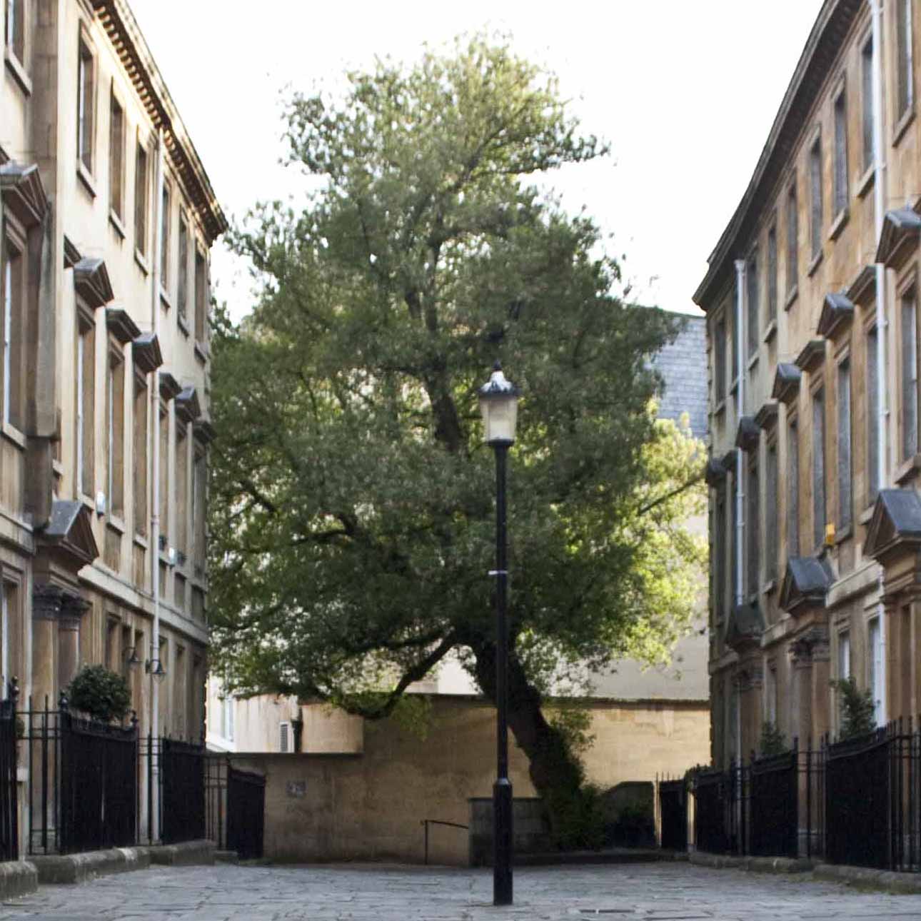
In this case, the horizontal image seems to work better - the vertical image gives strong lead-in to the tree but the pavement is too dominant in the image, taking up over half. To work, the vertical image needs some foreground interest. Balance is better is horizontal format.
This has been a useful exercise to formulate why vertical format sometimes works better than horizontal. In many cases it is simply the nature of the subject - as we have seen, alleys, people, running water and buildings all suit the vertical orientation better in many cases. Vertical images often have better lead-ins to the subject, and more depth. But sometimes this works less well (as with the last image) when the foreground is uninteresting. Balance can be lost with the vertical format.
In other cases above, the horizontal and vertical formats give rise to distinctly different images, where the main subject changes; the tour group and Pulteney bridge images for example.
The lesson is to keep thinking both horizontally and vertically and I shall use both more often when taking what appears to be the same subject. This exercise has taught me that the resultant images may be more different than is immediately obvious.
Aside from the exercise itself, I also have learnt in future to avoid rushing too much. Some of these images could have been improved by more thoughtful composition. There were many images taken that do not feature above; possibly fewer taken with more care would have provided a more professional outcome. The idea worked very well; the execution could have been been better.