"...you have produced some very good images here. You have acquitted this assignment very well and demonstrate a good understanding of the varying colour relationships"
One has to be more than satisfied with this. It demonstrates the following to me:
1) I was more relaxed about this Assignment as made clear in notes - managed to use it to complement my photography;
2) I am learning - specifically becoming more accustomed to what is required but actually also taking better shots;
3) Using more imagination. I thought the images on the blogs I saw were not that imaginative and tried to look out for some less obvious subjects. Tutor made comment that many students use flora as subjects. To me that was the easy option, not helped by the fact that I seem never to be able to take good floral images.
Specific comments:
1. Cardboard cartons - point well made that might have added more on context. I was a little short on commentary;
2. Tutor points out danger of adding unnecessary verbiage, notably in this case the source of the towels. Point noted, though it was said to stress the point that it was only after an impulse buy that I realised that had a useful colour match; but there is a need to keep professional in commentary;
3. Tutor claims gown image is greyish so will send jpeg as requested. He notes the textural strength of the image (which attracted me also), and good composition;
4. The sunset image is "well captured with a very good range of exposure". Pleasing as this shot is scarcely post processed. Tutor would favour the sun up and to left nearer 'sweet spot'. In a 3:2 frame, this would reduce or even eliminate the power of the reflection in the clouds that balances beautifully the strength of the sun so not sure agree with this.
5. Tutor likes the Harley Davidson fuel tank image. I was pleased with this image, the old adage of "close, then closer still" really coming to the fore. Tutor asks whether I had opportunity to explore variations in depth of field, possibly racking ISO up to 4k. Answer is that 450d can go only to ISO 1600. I could have tried that to give a greater depth of field but not sure it would have improved the image. ISO noise is a particular problem for the shiny surfaces in this image and the gain in DOF would have been mitigated by the inevitable loss of sharpness when reducing ISO noise.I like the shallow DOF as it enhances the silver cap. Also queries length of lens - it was 53.0 mm using the Canon standard 18-55mm lens.
6. Tutor sees "real strength in framing and angle of the kayak shot". This was result of mentor's "low and close" mantra. I like this image more each time I see it; it is just a great shot for three colour relationships. Queries whether intentionally crop the top of the kayaks. Not quite sure what this means as on my blog there is a lot of blue sky.
7. Good range of texture seen in the coral, and tutor sees as I did the fine balance of yellow and green.
8. Pleased that tutor saw the light effect in the sweet jars, and also the balance obtained by having the wood between them. I was pleased with this image - a good example of a shot that would never have dreamed of taking otherwise.
9. The cocktail umbrellas is my favourite image, and comments are favourable. Tutor notes also how the white points and struts draw the eye.
10. The bathers image is well received - I was slightly worried about the composition of this shot but thought it was fun image, a sentiment shared by tutor.
11. The ceramic butterfly shot "also works well - a good find and a well executed close shot". This image grows on me since first taking. I wondered whether a tighter crop would be better but on reflection it is fine as is - the green head needs to be small in this image as strong focal point and the eye would go nowhere else if it were larger in the frame.
12. The other sunset image shows colours "working well together" with the timber piles making for a contrast with the smooth natural shapes; I had not noticed this: in the desire to get colours working for the Assignment, it is easy to forget other aspects of the shot.
13. Gown shot also suffers a bit from the green being an olive colour; but tutor sees, as I did, the considerable impact of the orange stripe in this image.
14. The cherry shot was the first image I selected for this Assignment - it had the lot: complementary colours, as well as an accent, and a good image to boot. Tutor thinks a closer shot would also work with a more variable focus; agree, should have opened the aperture for an alternative shot.
15. The rope is a personal favourite and pleased that tutor sees "a pleasing effect". He also sees something I had not: the grid of the fence contrasting with the organic folds of the rope. As with 12, I learn here the need to look a the whole image, not just the aspect of the exercise.
16. "The shot of downtown Chicago is really very good". Tutor compliments on the sparing use of HD software. I mentioned in learning notes that Photomatix (and the CS5 HDR filter) is an unpredictable tool. To honest, I was not sure it would work for this image and took 3 images simply because could hold the camera in a fixed position, having no tripod. I produced a HDR image with Photomatix first time with no further processing, without going to the "hideously false" extremes tutor evidently dislikes (I assume he means the grunge images one of which I used in Assignment 2; they can work for some kinds of images - see Scott Kelby's images). The composition works and tutor sees the orange green balance as well as the accented orange light.
17. The shot in the hotel lobby is "very nice". Remarks that the chiaroscoro effect works well, though could have gone for a softer effect on the light. Agree, it is rather sharp so adjusted for soft focus using Topaz detail. Here is the before as per the Assignment and after processing:


The softer focus in the second image is preferable to the image presented in the Assignment
18. The Chevrolet was a last image that only just made the Assignment. I liked that colour gave a strong impact and contras to the geometric grill, a fact noticed by tutor.
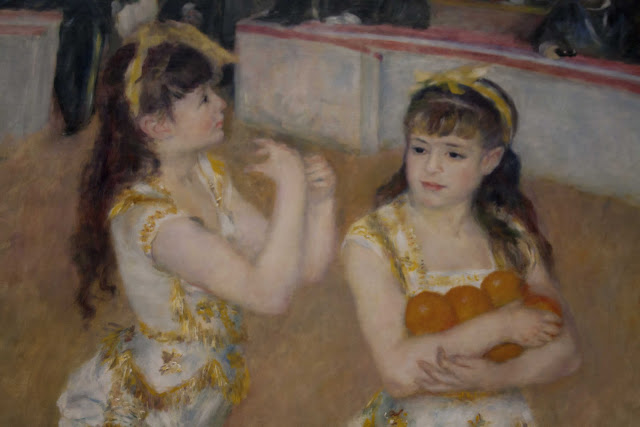
Tutor also compliments on "excellent" approach and execution of the exercises. Please as have been diligent to ensure they are taken seriously. He adds to look a the work of painters - ironically I did exactly that in Chicago Art Museum where took this shot of a Renoir:
1. Cardboard cartons - point well made that might have added more on context. I was a little short on commentary;
2. Tutor points out danger of adding unnecessary verbiage, notably in this case the source of the towels. Point noted, though it was said to stress the point that it was only after an impulse buy that I realised that had a useful colour match; but there is a need to keep professional in commentary;
3. Tutor claims gown image is greyish so will send jpeg as requested. He notes the textural strength of the image (which attracted me also), and good composition;
4. The sunset image is "well captured with a very good range of exposure". Pleasing as this shot is scarcely post processed. Tutor would favour the sun up and to left nearer 'sweet spot'. In a 3:2 frame, this would reduce or even eliminate the power of the reflection in the clouds that balances beautifully the strength of the sun so not sure agree with this.
5. Tutor likes the Harley Davidson fuel tank image. I was pleased with this image, the old adage of "close, then closer still" really coming to the fore. Tutor asks whether I had opportunity to explore variations in depth of field, possibly racking ISO up to 4k. Answer is that 450d can go only to ISO 1600. I could have tried that to give a greater depth of field but not sure it would have improved the image. ISO noise is a particular problem for the shiny surfaces in this image and the gain in DOF would have been mitigated by the inevitable loss of sharpness when reducing ISO noise.I like the shallow DOF as it enhances the silver cap. Also queries length of lens - it was 53.0 mm using the Canon standard 18-55mm lens.
6. Tutor sees "real strength in framing and angle of the kayak shot". This was result of mentor's "low and close" mantra. I like this image more each time I see it; it is just a great shot for three colour relationships. Queries whether intentionally crop the top of the kayaks. Not quite sure what this means as on my blog there is a lot of blue sky.
7. Good range of texture seen in the coral, and tutor sees as I did the fine balance of yellow and green.
8. Pleased that tutor saw the light effect in the sweet jars, and also the balance obtained by having the wood between them. I was pleased with this image - a good example of a shot that would never have dreamed of taking otherwise.
9. The cocktail umbrellas is my favourite image, and comments are favourable. Tutor notes also how the white points and struts draw the eye.
10. The bathers image is well received - I was slightly worried about the composition of this shot but thought it was fun image, a sentiment shared by tutor.
11. The ceramic butterfly shot "also works well - a good find and a well executed close shot". This image grows on me since first taking. I wondered whether a tighter crop would be better but on reflection it is fine as is - the green head needs to be small in this image as strong focal point and the eye would go nowhere else if it were larger in the frame.
12. The other sunset image shows colours "working well together" with the timber piles making for a contrast with the smooth natural shapes; I had not noticed this: in the desire to get colours working for the Assignment, it is easy to forget other aspects of the shot.
13. Gown shot also suffers a bit from the green being an olive colour; but tutor sees, as I did, the considerable impact of the orange stripe in this image.
14. The cherry shot was the first image I selected for this Assignment - it had the lot: complementary colours, as well as an accent, and a good image to boot. Tutor thinks a closer shot would also work with a more variable focus; agree, should have opened the aperture for an alternative shot.
15. The rope is a personal favourite and pleased that tutor sees "a pleasing effect". He also sees something I had not: the grid of the fence contrasting with the organic folds of the rope. As with 12, I learn here the need to look a the whole image, not just the aspect of the exercise.
16. "The shot of downtown Chicago is really very good". Tutor compliments on the sparing use of HD software. I mentioned in learning notes that Photomatix (and the CS5 HDR filter) is an unpredictable tool. To honest, I was not sure it would work for this image and took 3 images simply because could hold the camera in a fixed position, having no tripod. I produced a HDR image with Photomatix first time with no further processing, without going to the "hideously false" extremes tutor evidently dislikes (I assume he means the grunge images one of which I used in Assignment 2; they can work for some kinds of images - see Scott Kelby's images). The composition works and tutor sees the orange green balance as well as the accented orange light.
17. The shot in the hotel lobby is "very nice". Remarks that the chiaroscoro effect works well, though could have gone for a softer effect on the light. Agree, it is rather sharp so adjusted for soft focus using Topaz detail. Here is the before as per the Assignment and after processing:


The softer focus in the second image is preferable to the image presented in the Assignment
18. The Chevrolet was a last image that only just made the Assignment. I liked that colour gave a strong impact and contras to the geometric grill, a fact noticed by tutor.
Tutor also compliments on "excellent" approach and execution of the exercises. Please as have been diligent to ensure they are taken seriously. He adds to look a the work of painters - ironically I did exactly that in Chicago Art Museum where took this shot of a Renoir:

Overall, I am pleased that the effort I put into finding and photographing some good subjects for this Assignment appears to have paid off. I enjoyed the Assignment and it has boosted my confidence to progress further.